This week's extra Thing gives you some options! We're looking at data visualisation, and I have three tools for you.
Ever felt that something would be a lot simpler if you could explain it using a picture, but your artistic skills were left behind when you stopped using felt tips? Or perhaps you work better with a good diagram than a paragraph? Then data visualisation is what you need! These tools all make your scrap paper drawing into something intelligible, legible and presentable.
First off are two tools for making charts - Lovelycharts and Gliffy.
Both programmes allow you to create a variety of charts. In particular I have used Gliffy to create a decision tree/flow chart relating to some stock removals. If you need to communicate a set of data, or a decision-making process to a team, these tools can provide you with a good visual reference beyond a list, or a scribbled diagram.
Each programme has a slightly different set of available tools, so you'll need to select the one that works for you, and you'll need to create a free account as well.
Here's a floorplan that I created in Gliffy:
It's simple, but it serves the purpose I needed it for, and it took less than 10 minutes to complete. I've exported it, but I can also access it in my account to edit for a different size sofa, or extra pot plants.
Both programmes have libraries of standard elements to choose from, whether making a floor plan, a decision tree, a people network or a Venn diagram. And everything can be manipulated to change size and orientation, with most things also able to change colour too.
Because there are so many options I'm not going to suggest that you try a particular task - have a look at Lovelycharts and Gliffy and experiment with one or both, so that next time having some visual input would be handy, you can just login and get started.
Visualising in a different way...
Wordle is something that some of you who did the Things last year may already be familiar with. It is a great tool for visualising text in a more interesting form. By pasting in text, or linking to a blog, Wordle will create a visual collage, and make more frequently used words larger within it, thereby providing something between an artwork and a concordance.
It's a great tool to present data in a different manner, and can be used equally to engage users as to demonstrate trends to senior managers. It is however inherently limited, providing just this one function, albeit with multiple styling options for the final image. There is no account to sign up to with Wordle, but that does mean anything you create is public on the gallery. In general I think the way the text is displayed is too abstract for that to be a problem, but do bear it in mind.
Why not try using a link from one of your blog entries to create a picture - you might be surprised how often you use certain words! You'll need to use what you've learnt on screenshots to make the most of Wordle, as the html code provided doesn't necessarily give a big enough image.
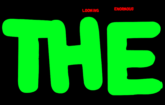
For more advanced Wordle users, there is the option to type your own text to create an artistic work that is devoid of textual meaning. Or, perhaps more usefully, you can use the 'language' link to remove common English words, so you don't end up with an enormous looming THE. The 'Advanced' button also allows you to get specific on both sizes and colours, to remove the slightly random nature of the resulting graphic.
So why not go and try at least one of these tools to brighten up your data.


I hope wordles are not public to the gallery if they have not been saved to the gallery....
ReplyDeleteThis comment has been removed by the author.
ReplyDeleteVery cool, thanks for sharing that Aidan!
ReplyDeleteOh -- and while we're on Wordle, here's another piece of data visualisation: a pole that lights up to show signal strength. I first heard of this via Tony Hirst (@psychemedia on Twitter). Long-exposure photography of the thing being carried round Oslo creates a show of phantom security fences. http://bit.ly/nZBUjF
ReplyDelete